Project Overview
UPHIVE tasked us with designing a cohesive branding language that embodies its commitment to wellness, sustainability, and style. The project involved creating a visually appealing logo, color palette, and brand identity that resonates with the target audience while reflecting the agency’s core values. Our goal was to establish a strong brand presence that could seamlessly expand into various product lines while maintaining consistency and relevance in the digital landscape.
Problem Statement
UPHIVE needed a brand identity that communicated its shift towards lifestyle wellness products while emphasizing sustainability and cohesion. The challenge lay in crafting a logo and branding language that captured the essence of the company’s ethos, incorporating elements of upcycling and minimalism while ensuring scalability and adaptability across diverse product categories.
Our Approach
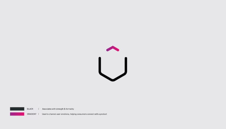
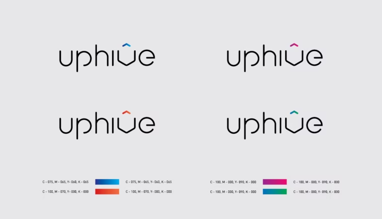
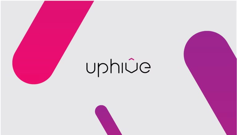
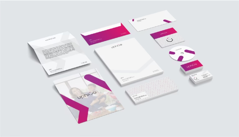
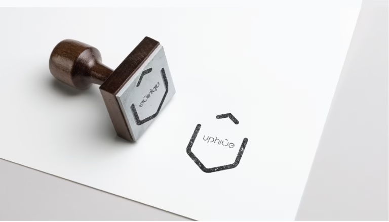
Leveraging the concept of a hive as a symbol of unity and productivity, we designed a hexagonal logo that seamlessly integrated the letter “V” within it, representing the brand name. Our color palette, featuring fresh gradients, instills a sense of vitality and trust, while our minimalist approach ensures versatility across digital platforms. By prioritizing sustainability, coherence, and consumer reassurance, we created a brand identity poised for success in the evolving wellness market.