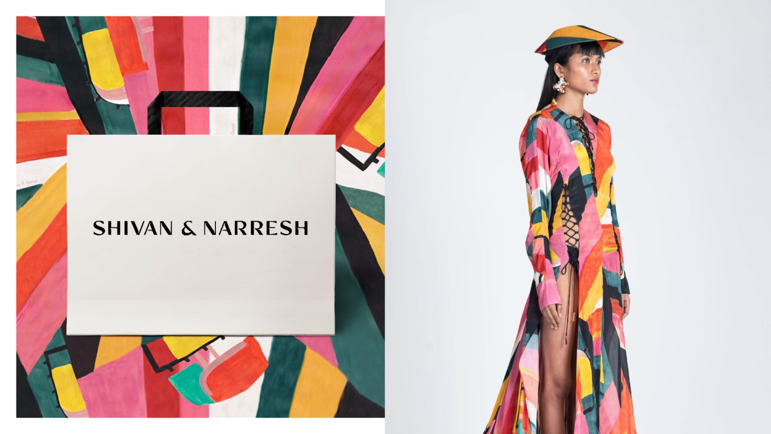
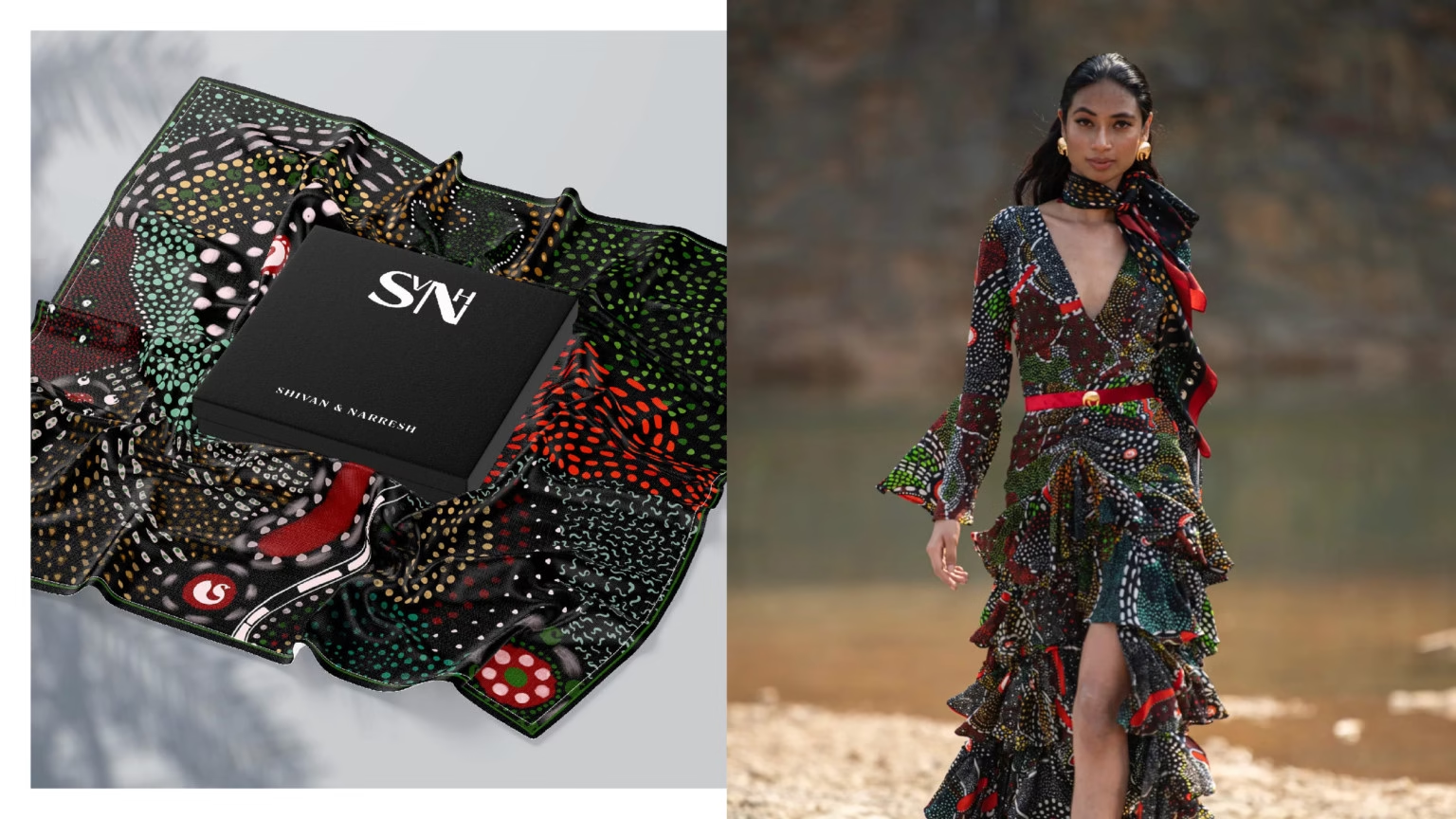
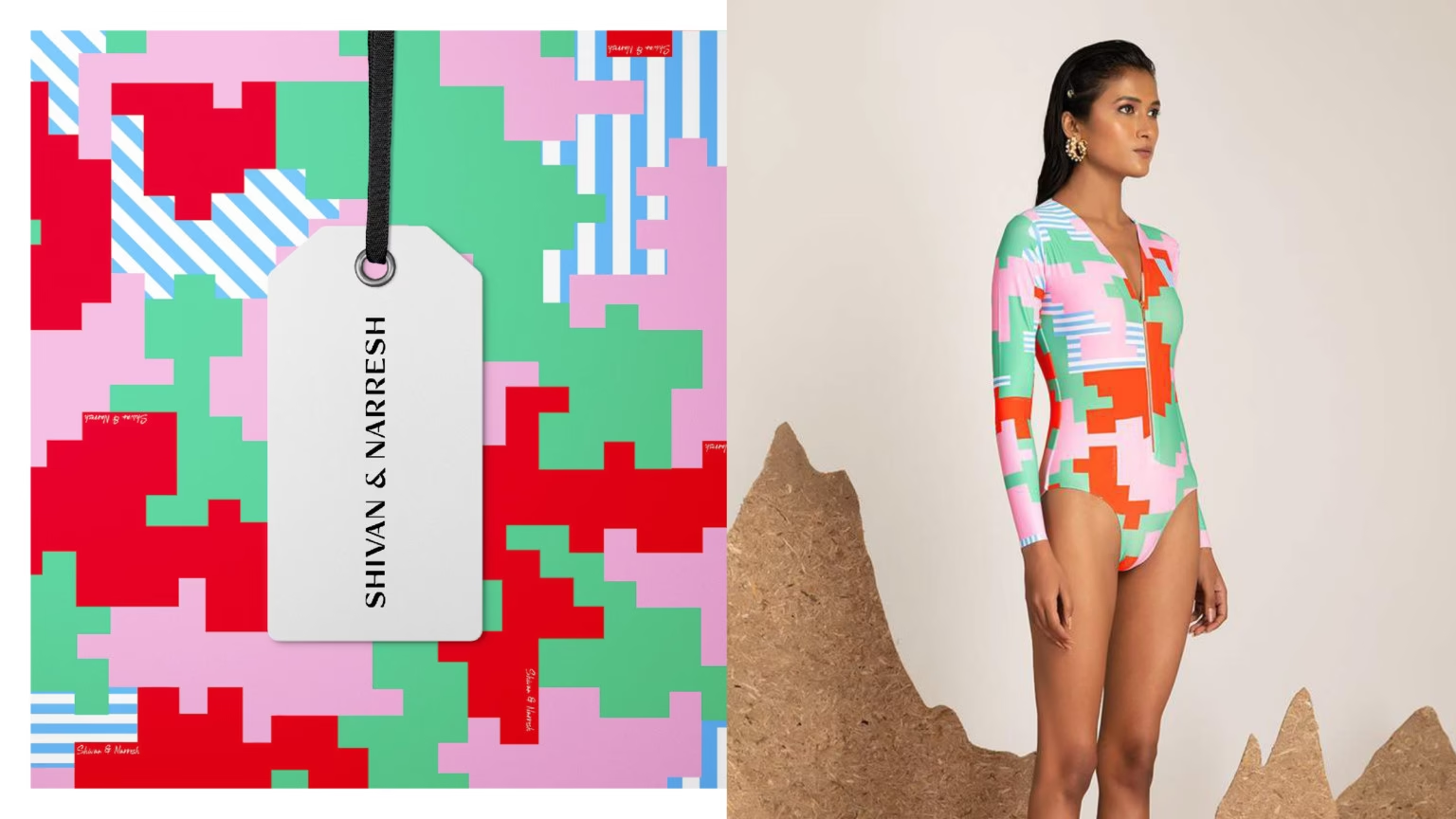
SHIVAN & NARRESH, based in New Delhi, pioneers luxury travel with iconic Lycra Sari and Bikini Sari designs, adorned by celebrities globally.
SHIVAN & NARRESH, based in New Delhi, pioneers luxury travel with iconic Lycra Sari and Bikini Sari designs, adorned by celebrities globally.
CLIENT NAME
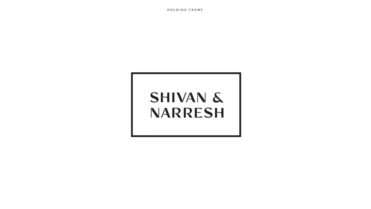
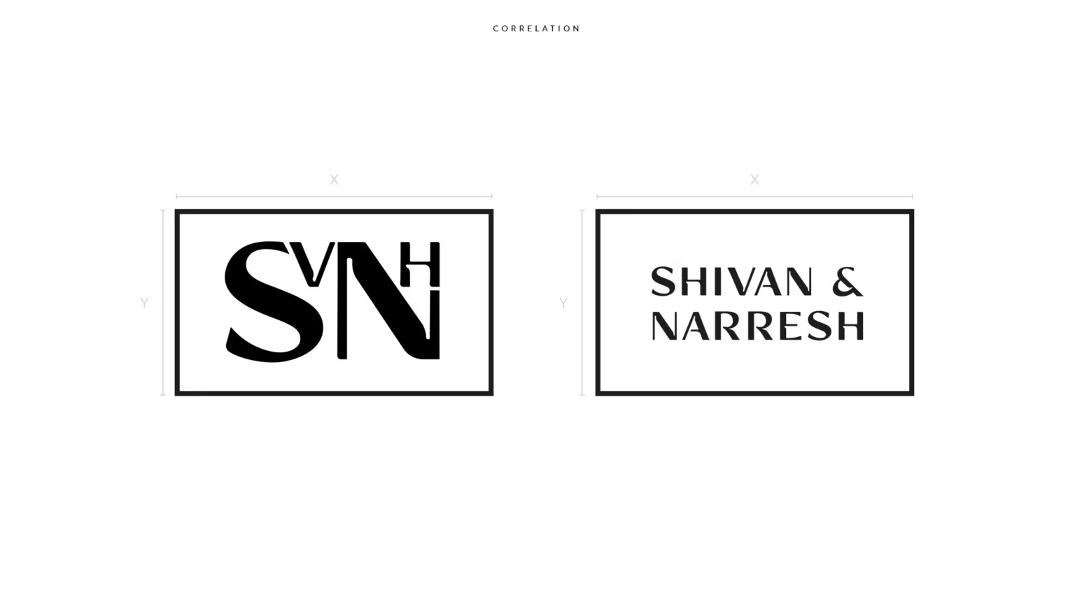
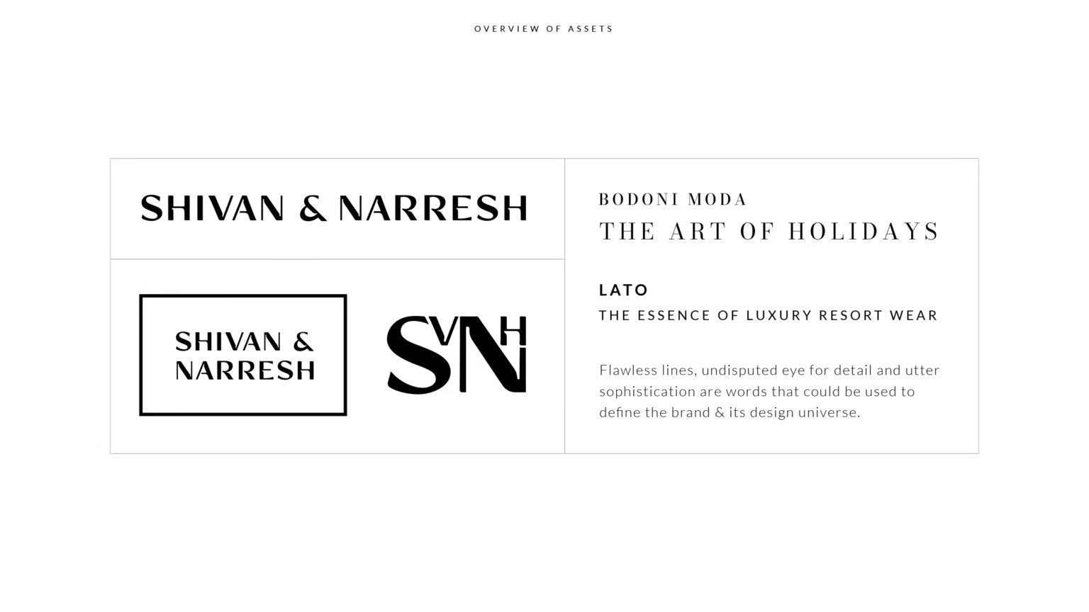
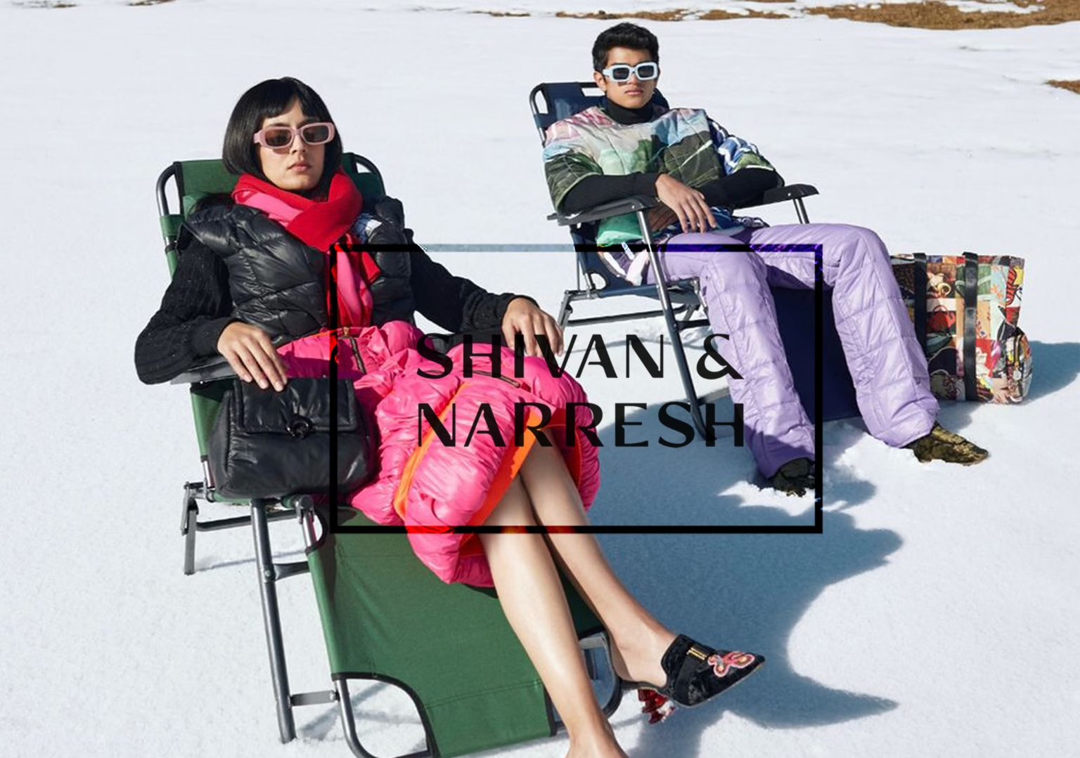
Shivan & Narresh
SHIVAN & NARRESH, headquartered in New Delhi, redefine luxury travel with their groundbreaking creations: the Lycra Sari and Bikini Sari. These iconic designs transcend conventional boundaries and have been embraced by an array of global celebrities, including Kim Kardashian, Priyanka Chopra, and Sonam Kapoor, cementing their status as trendsetters.