Project Overview
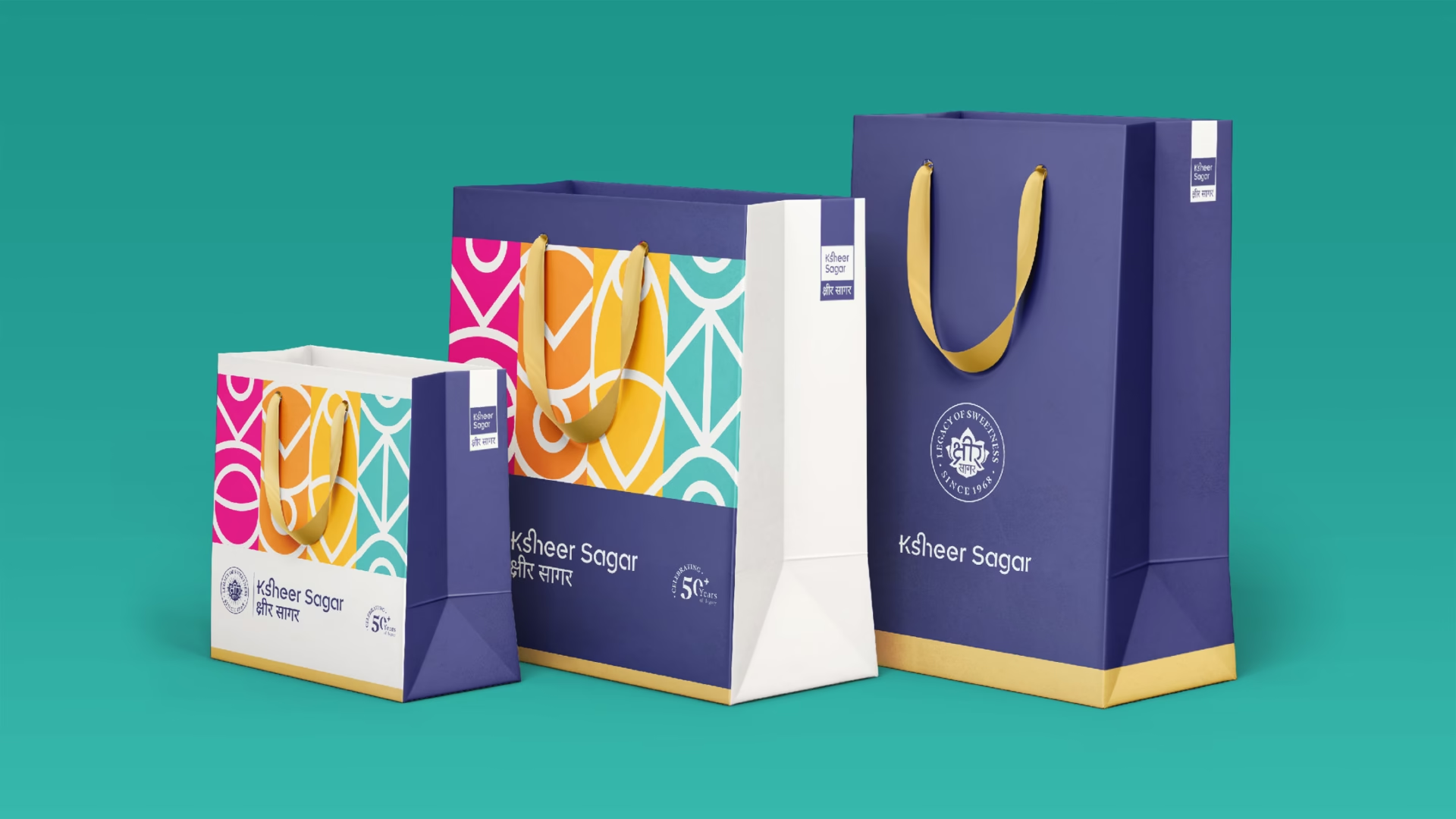
Ksheer Sagar, a 50-year-old Indian sweet brand based in Varanasi, sought a complete rebranding to align with modern sensibilities while preserving its rich heritage. Known for its authentic, traditional sweets made from recipes passed down through generations, Ksheer Sagar wanted a fresh, clean, and honest brand image that communicated quality, purity, and the cultural essence of Banaras.
Problem Statement
The existing brand image of Ksheer Sagar did not effectively communicate the quality and authenticity of its products to a broader audience. The traditional aesthetic, while rich in heritage, needed a modern update to attract younger customers and expand its reach. Additionally, the brand required a cohesive design language that could be consistently applied across various marketing materials, enhancing brand recognition and appeal.
Our Approach
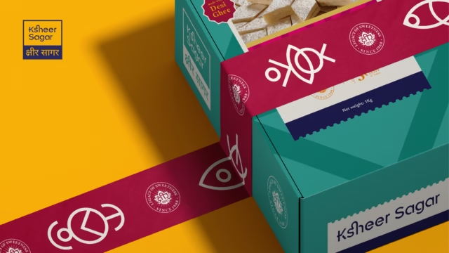
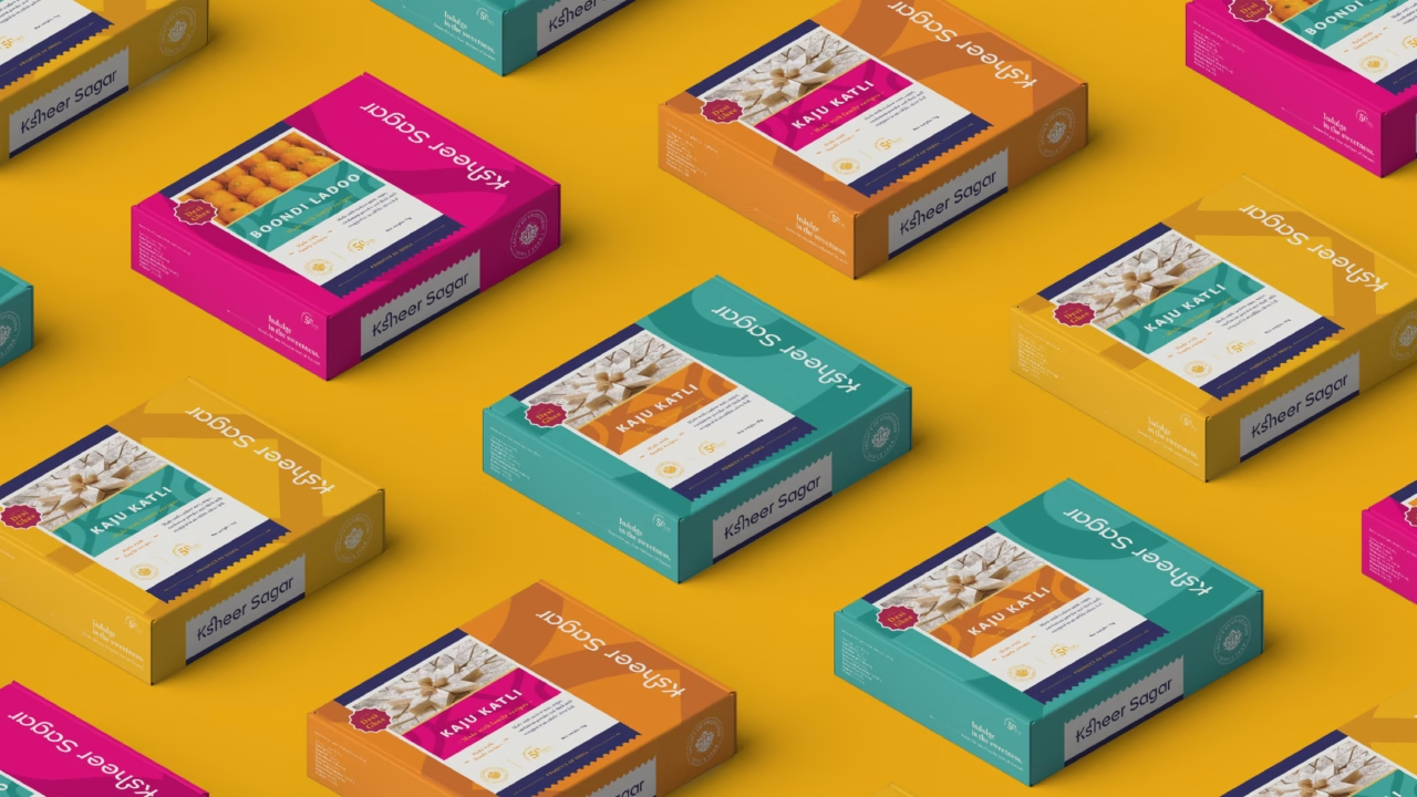
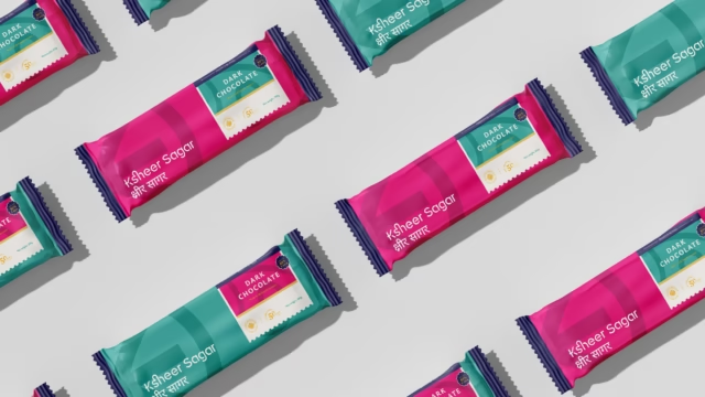
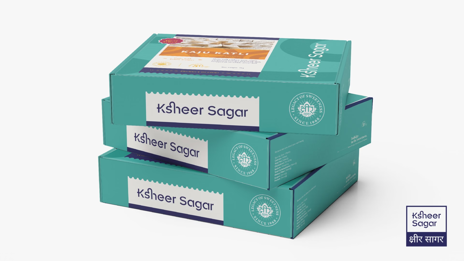
We selected the lotus flower for the logo, symbolizing purity and aligning with Ksheer Sagar’s ethos. The brand name was written in both vernacular and English to broaden its appeal. The primary colors reflect Varanasi’s heritage, while secondary colors symbolize the city’s joy and vibrancy. Unique symbols inspired by Banaras’ structures were integrated into patterns across various materials, balancing tradition with contemporary aesthetics. Emphasizing the use of authentic ingredients and traditional recipes, we reinforced the brand’s commitment to quality and purity, making it appealing to both loyal customers and a new generation.