Project Overview
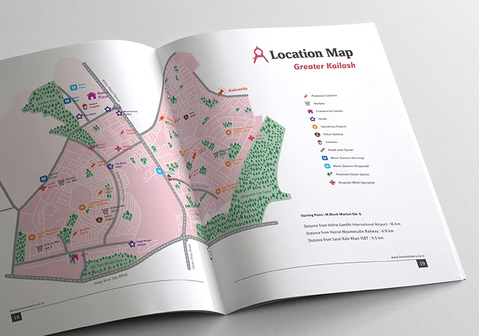
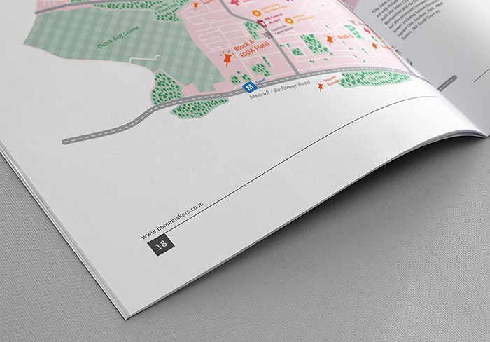
Home Makers, the real estate research and services arm of NNA Consultancy Services Pvt. Ltd., sought to enhance their Location Reports for FY 2015-2016. These reports serve as vital resources for end-users and investors, offering insights into housing and investment decisions. Our task was to revamp the visual language and cover illustrations, ensuring clarity and engagement.
Problem Statement
The existing visual language of Home Makers’ Location Reports lacked distinctiveness and did not effectively convey the depth of information contained within. With the growing demand for comprehensive data visualization, there was a need to modernize the design approach to better resonate with target audiences. Additionally, the cover illustrations lacked visual appeal and failed to capture the essence of each report, diminishing their impact.
Our Approach
Our design approach involved comprehensive research and analysis to understand industry standards, competitor approaches, and target audience preferences. We collaborated closely with Home Makers to align with their brand ethos and objectives. Developing a distinctive visual identity, we focused on enhancing readability and comprehension through a cohesive color scheme and infographic style treatment. Engaging cover illustrations were conceptualized to encapsulate the unique characteristics of each location, inviting readers to explore further. Through an iterative design process, we refined our deliverables to meet Home Makers’ expectations and resonate with their audience, ultimately setting a new standard for industry analysis.