PROJECT OVERVIEW
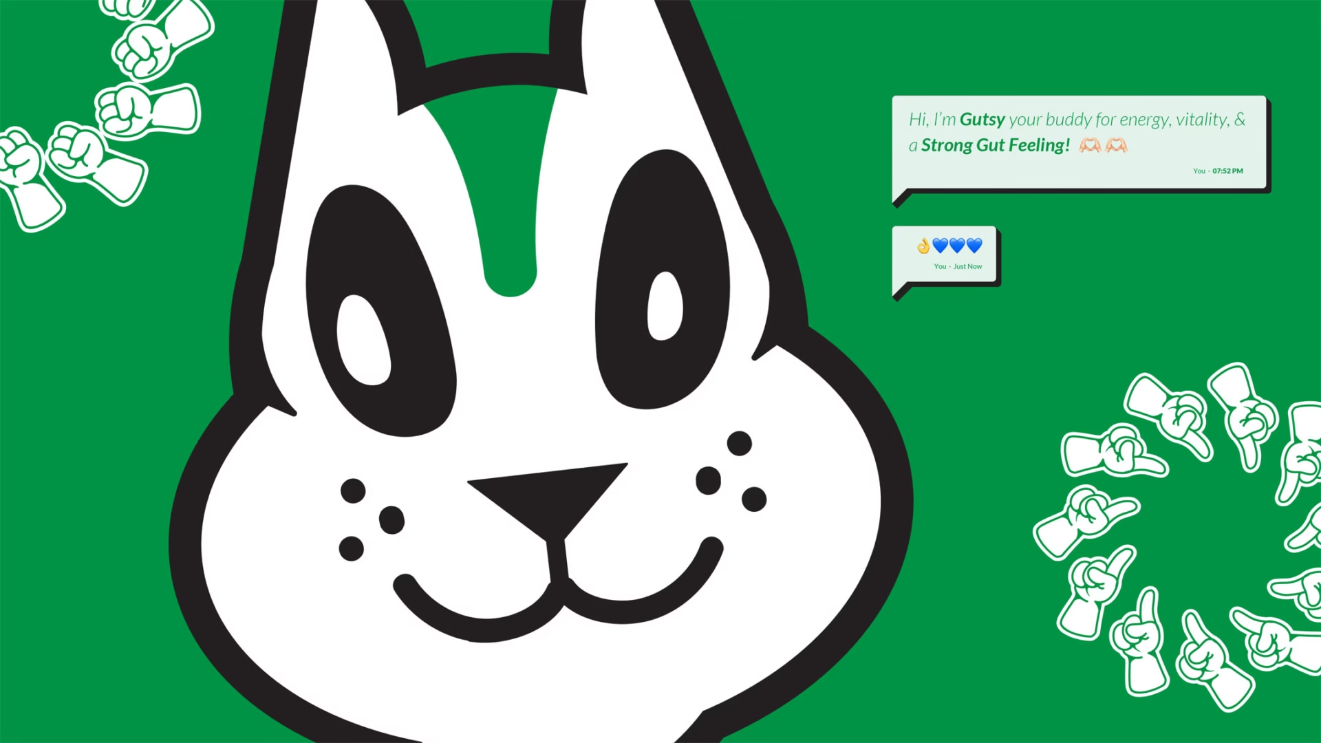
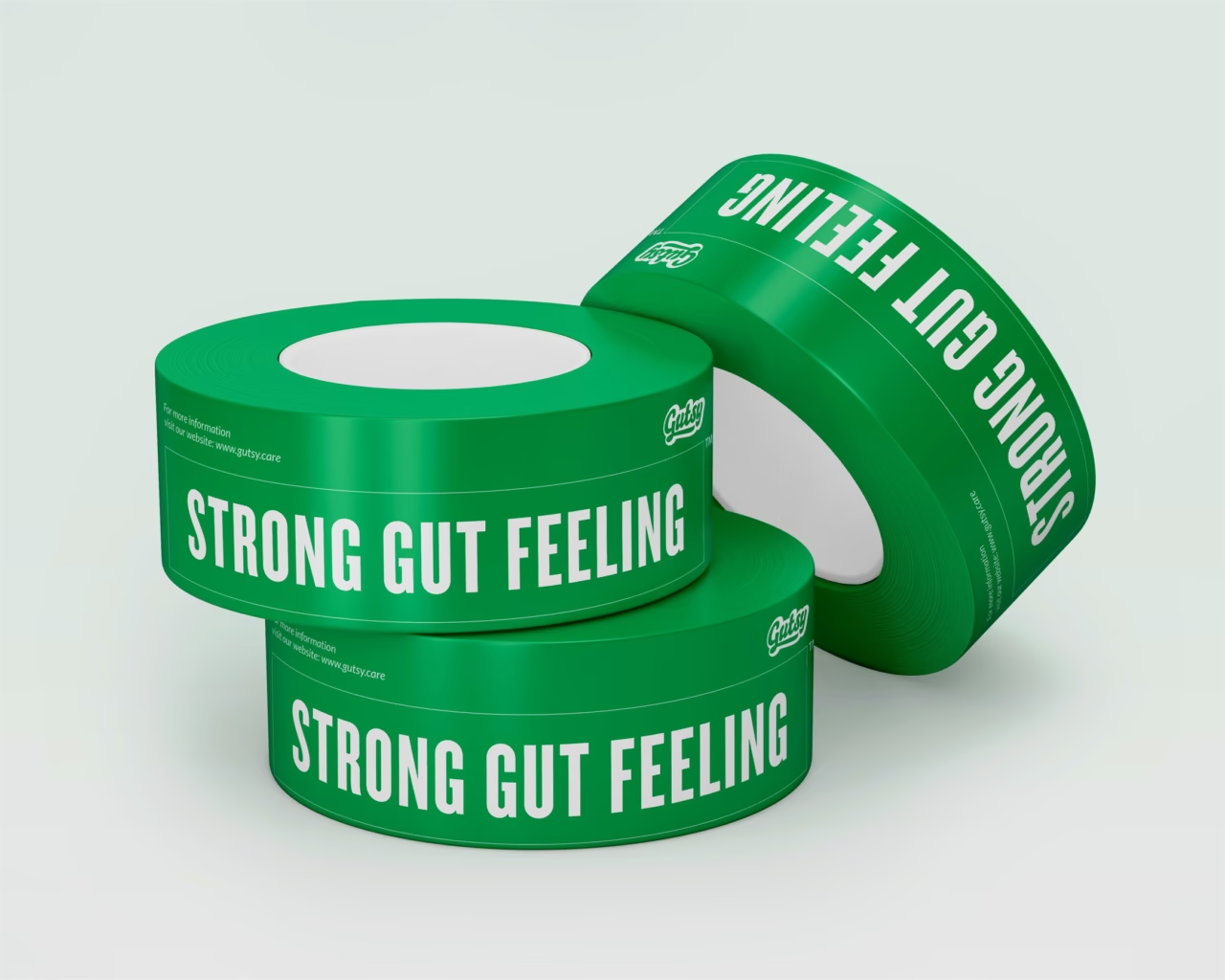
Gutsy began with one long, honest conversation about how gut issues can make people feel small on the inside. The idea was simple, take away the fear, add some fun, and stay far from the medicated, spa-like world the category lives in. Everything comes down to the gut, and to be Gutsy, all you need is a strong gut feeling. The name, the tagline, and the attitude all came from there.
PROBLEM STATEMENT
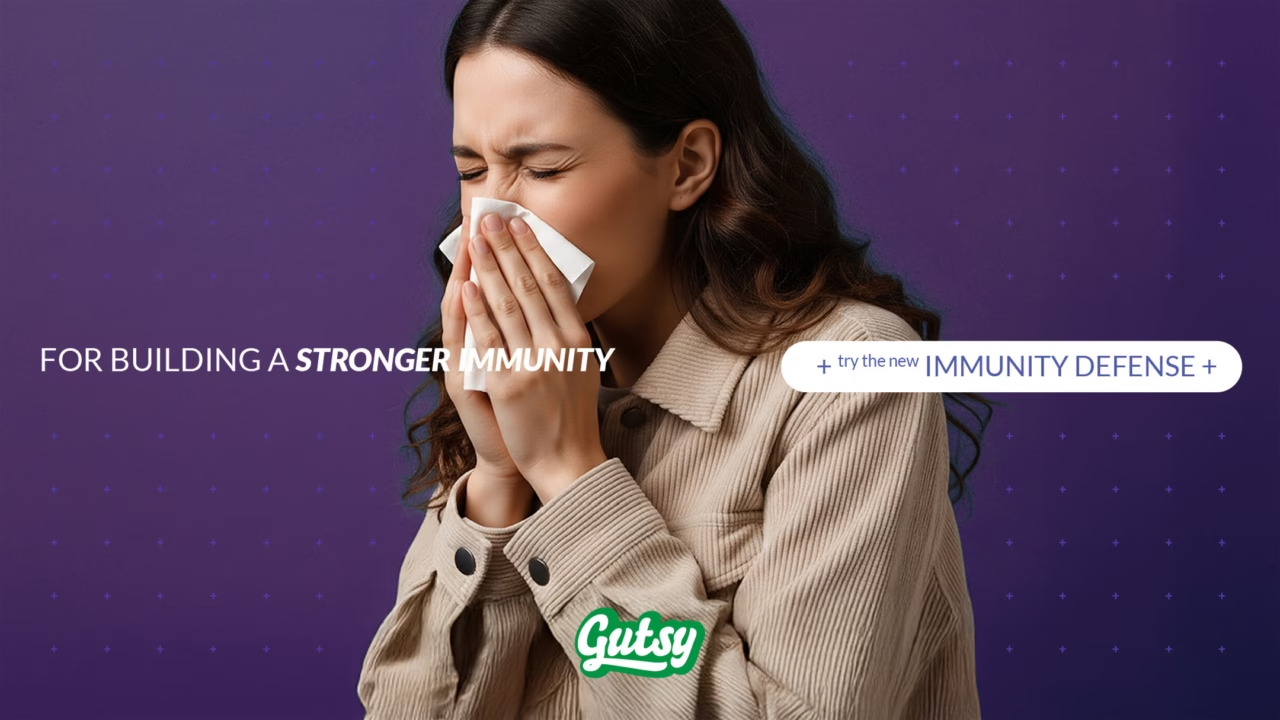
The category looked too serious and too clinical, which instantly created distance. We needed a brand that felt friendly, cheerful, and full of life, something that could stand out without trying too hard. The challenge was to shape an identity, mascot, and packaging system that carried this personality while still being clear, useful, and practical across all touchpoints.
OUR APPROACH
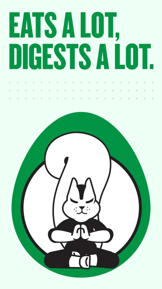
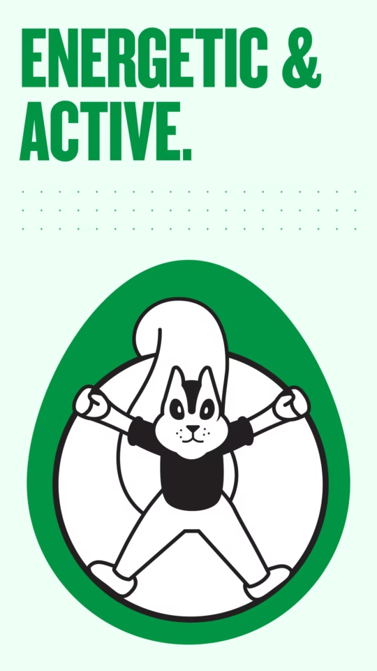
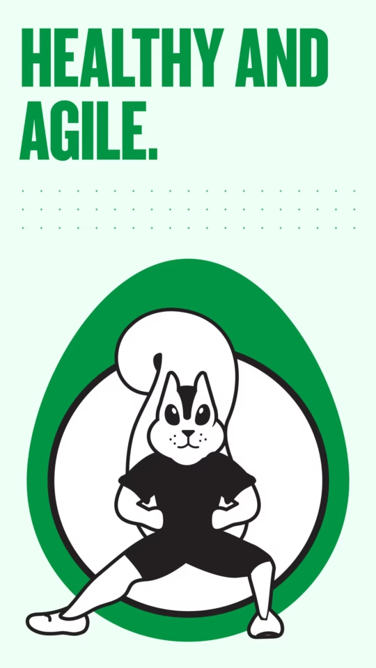
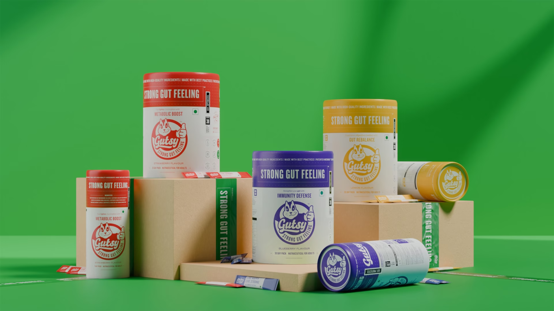
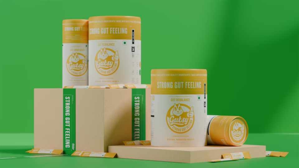
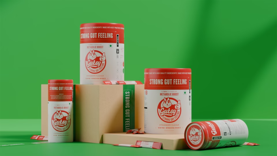
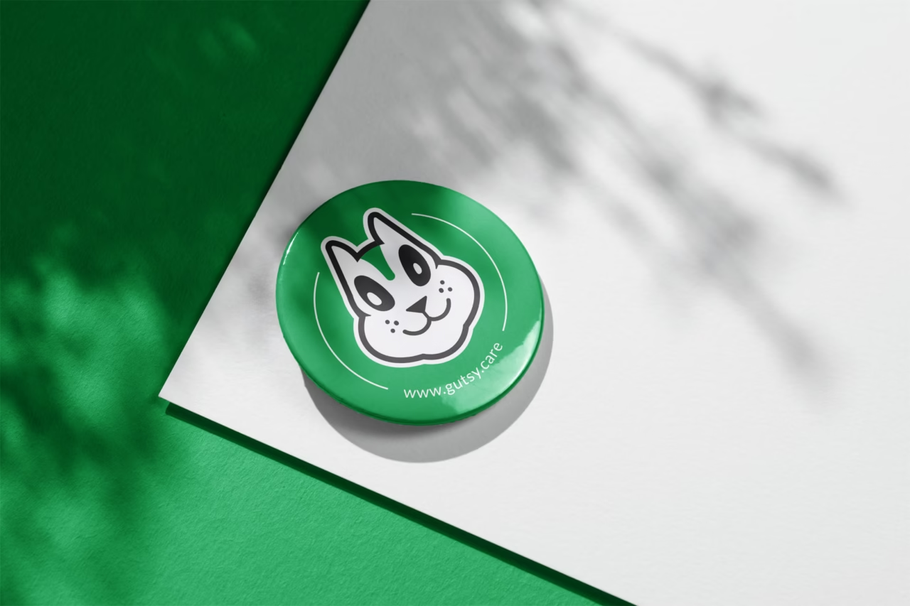
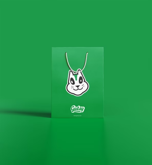
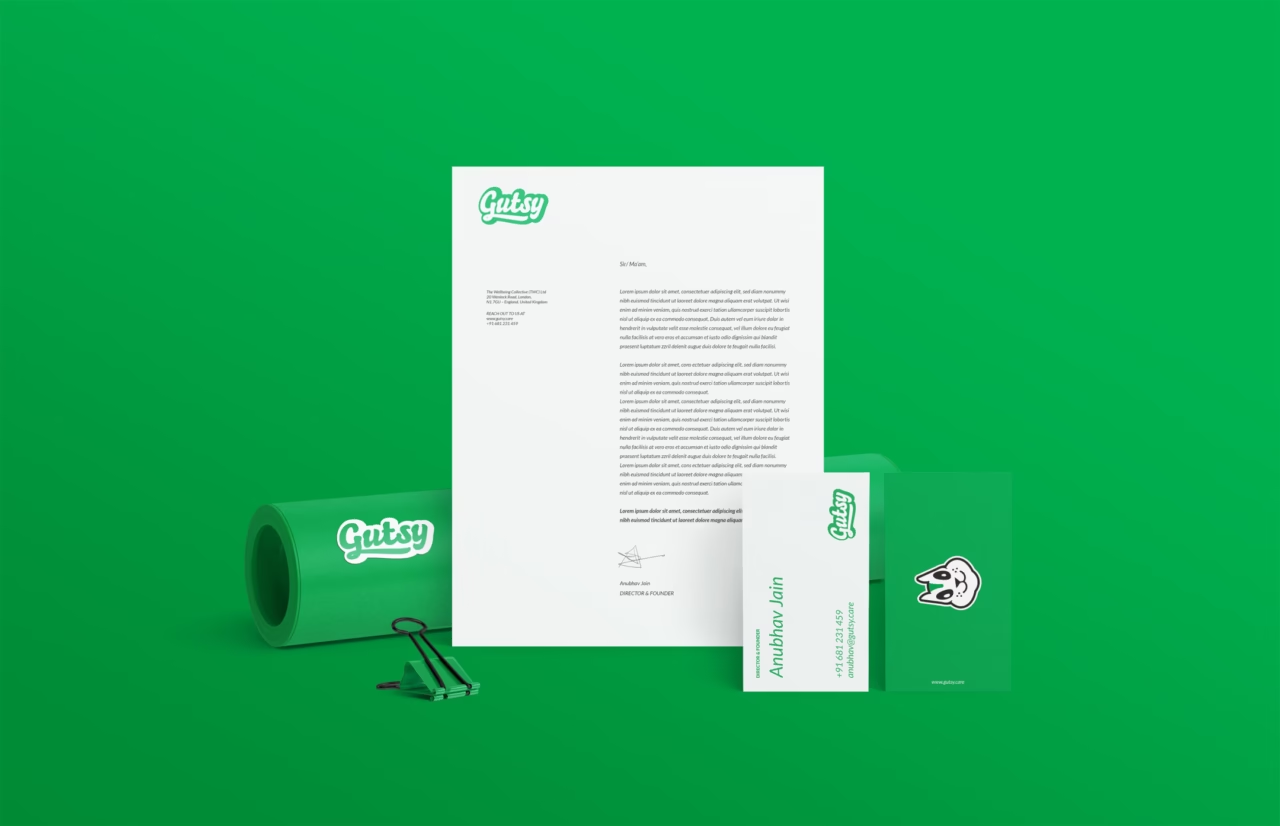
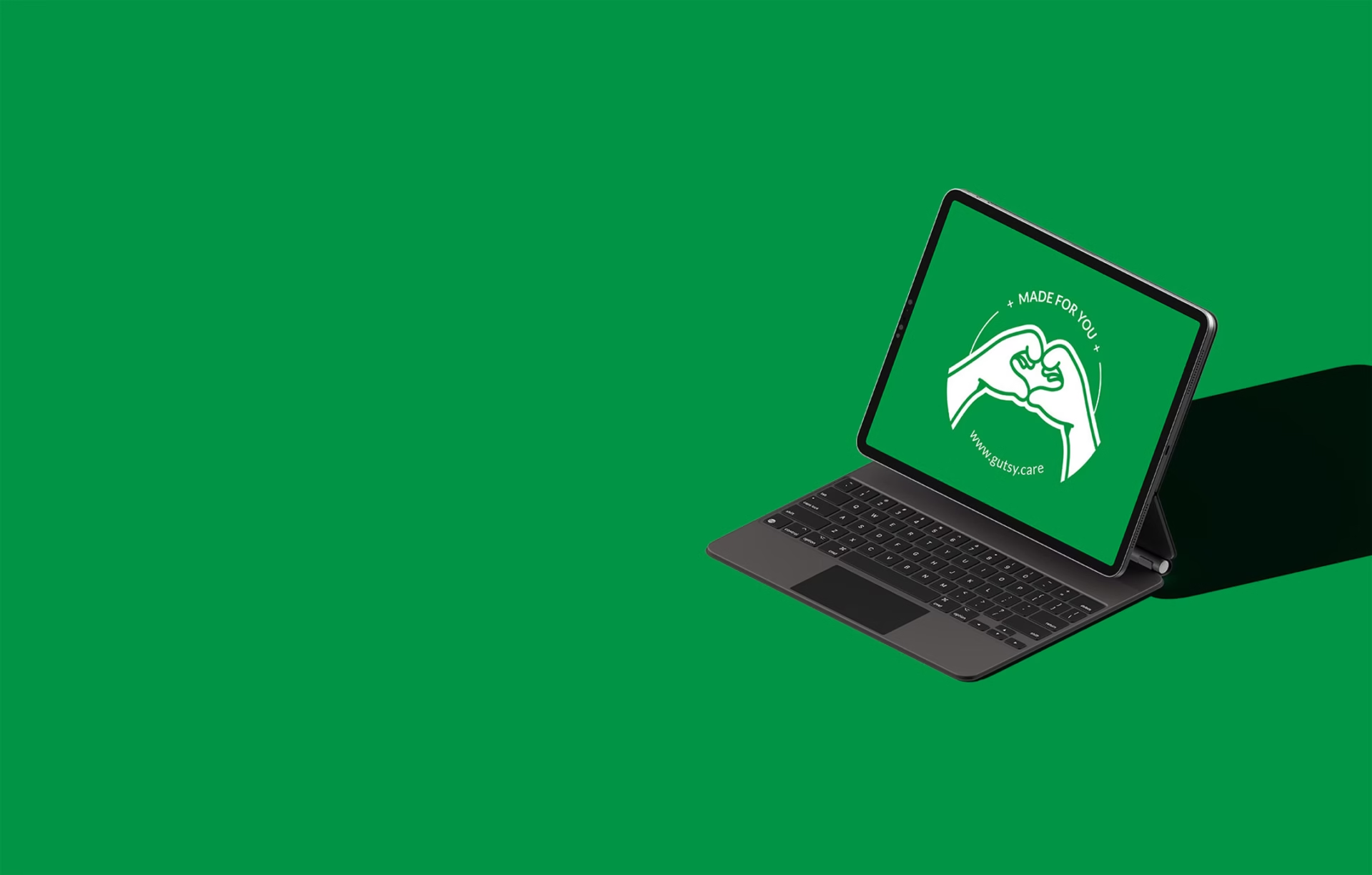
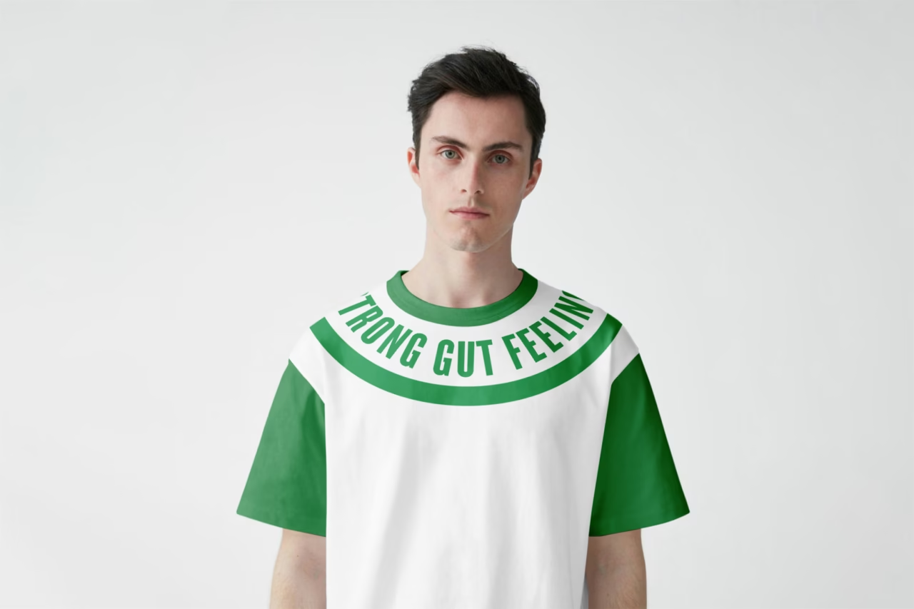
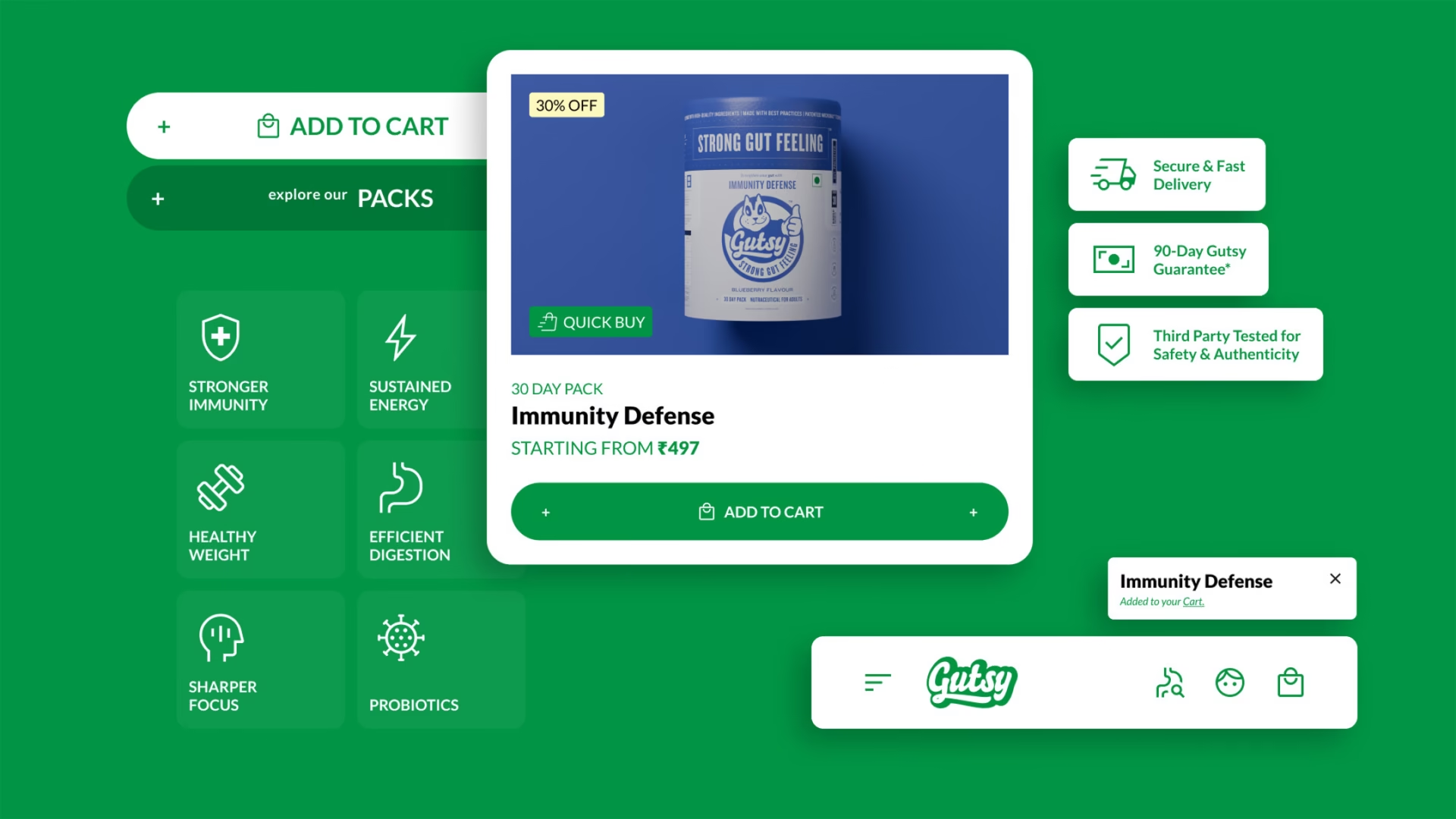
We designed a fleshy, happy logotype with a little flourish that hints at the fearlessness we wanted. The idea naturally called for a mascot, someone active, foodie, fearless, and a squirrel fit the brief better than anything else. Together, the mascot and the logotype formed a crest-style logo that brings the name, story, and tagline together as one complete unit. Packaging became our main playground: a clean grid system, chatty information, flavour-driven colours, and SKUs that kept things exciting. The website stayed true to the brand even within Shopify’s limits. With consistent communication, fun merchandise, and lively social conversations, the product quickly became the hero, earning strong traction and repeat customers within months.