Project Overview
The project aims to create a brand identity and visual language for “Flow,” a unique establishment that seeks to redefine the post-COVID experience by offering a space that encourages exploration and embraces change. Flow intends to become a haven for individuals seeking novel experiences, breaking away from the monotony of the familiar and venturing into the unknown.
Problem Statement
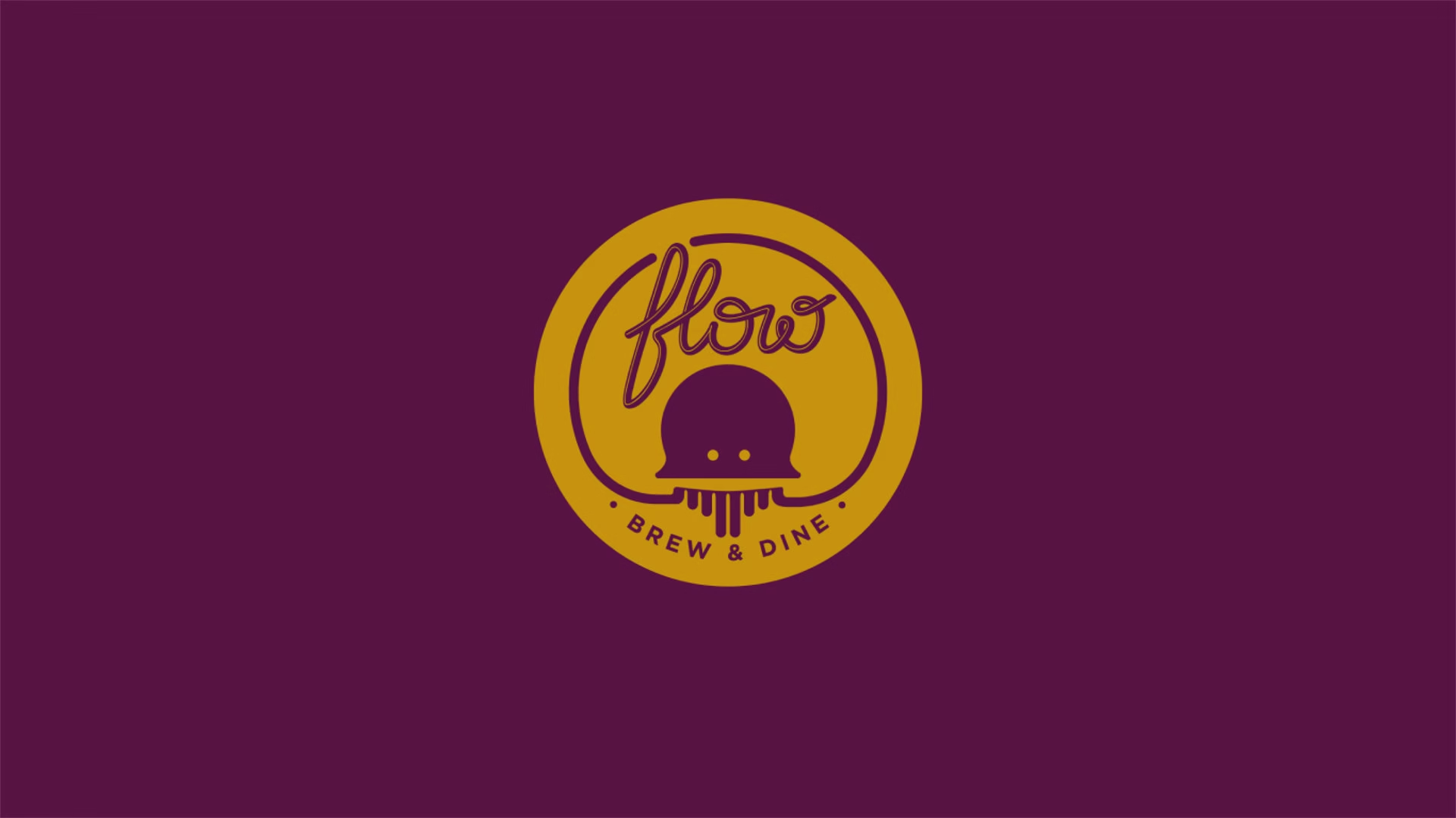
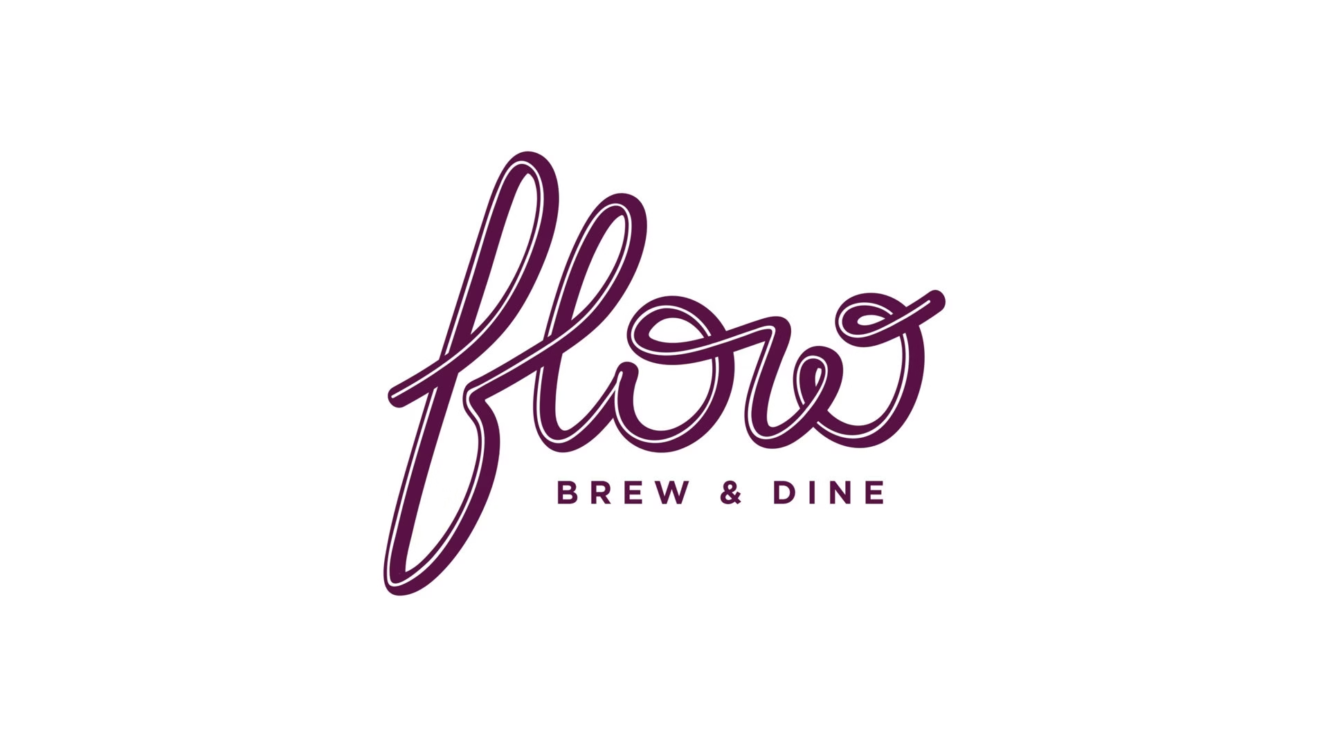
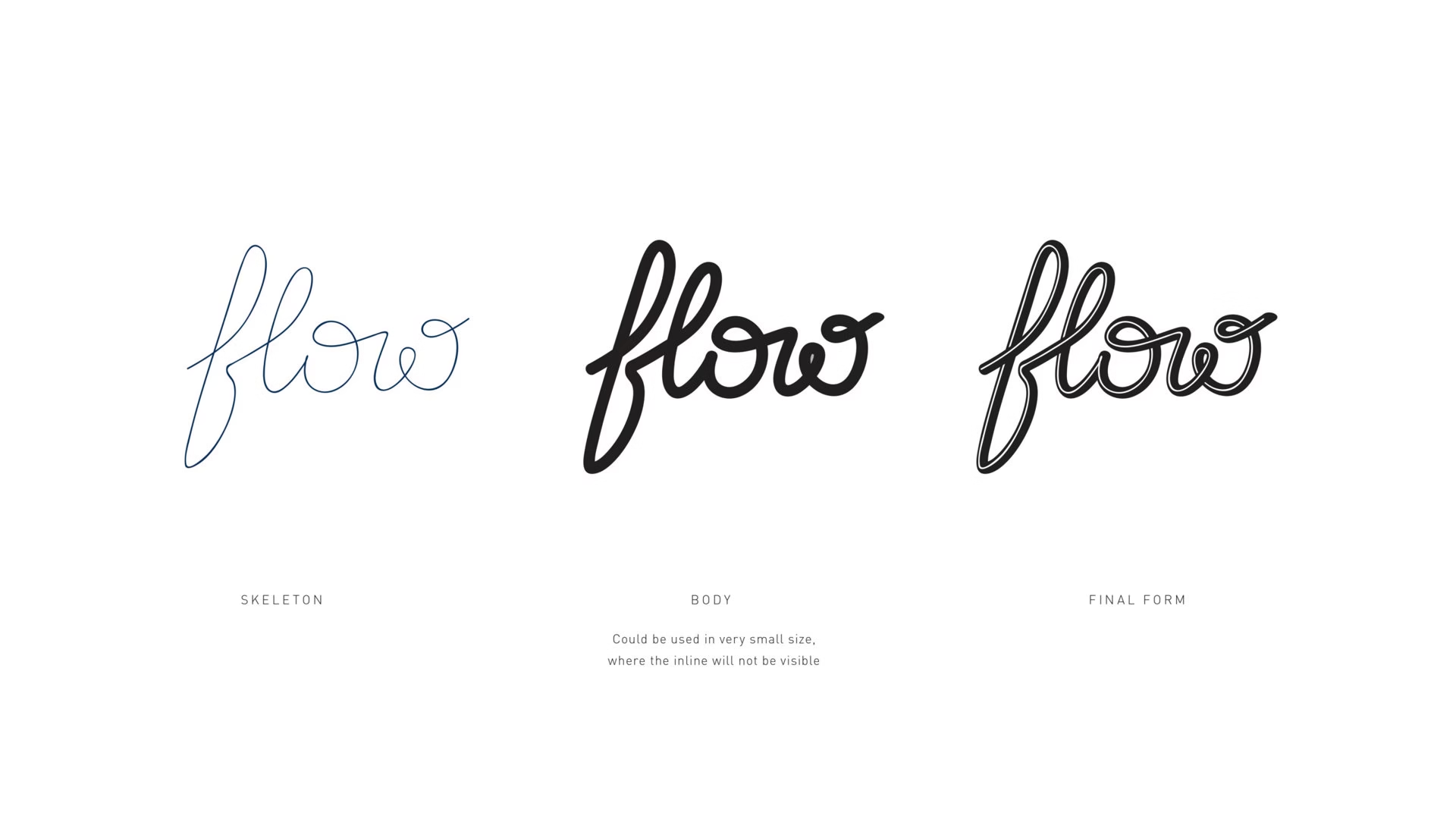
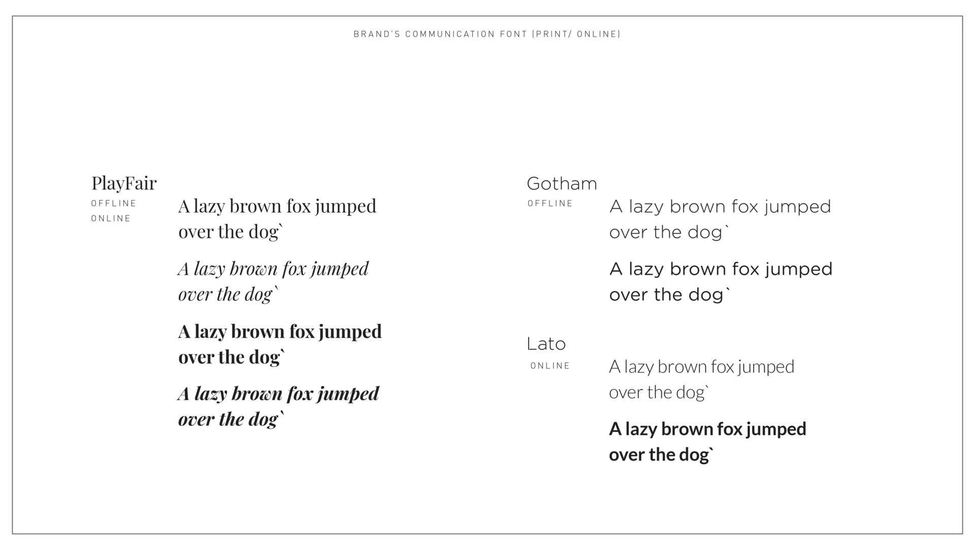
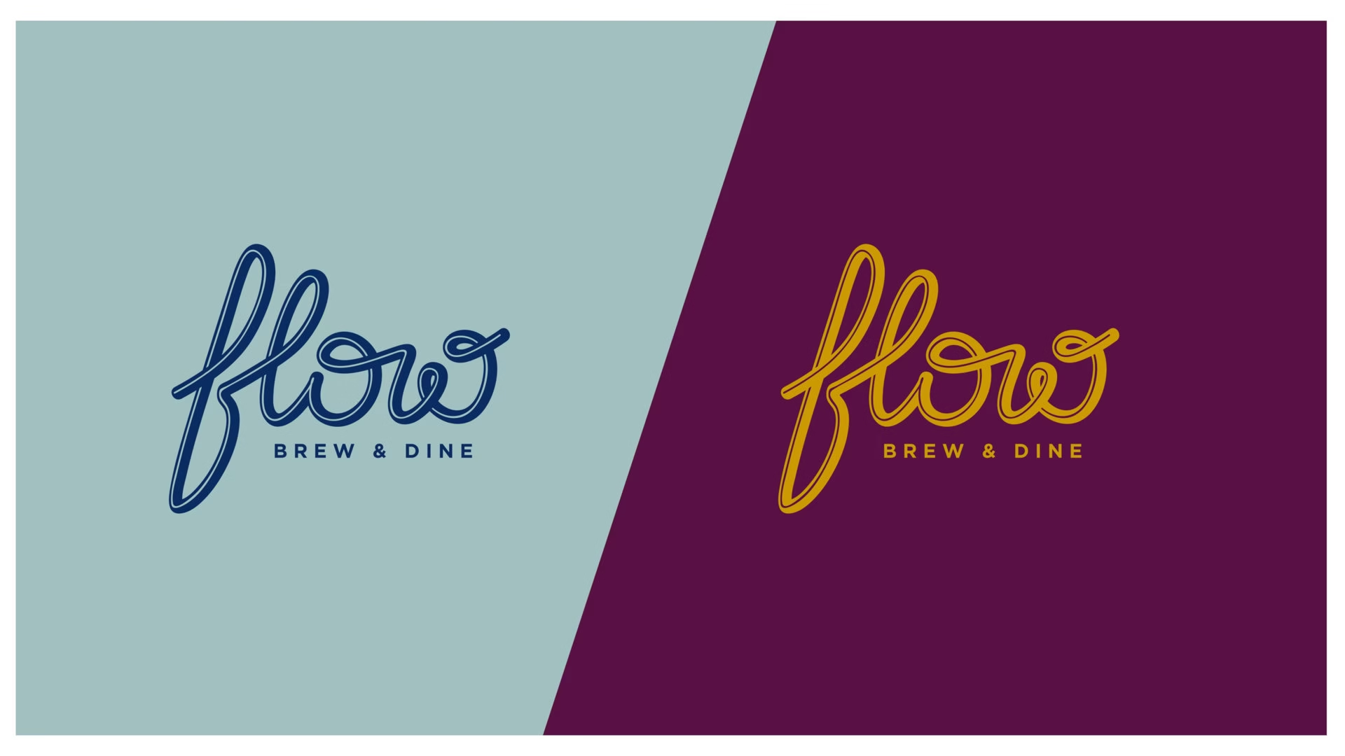
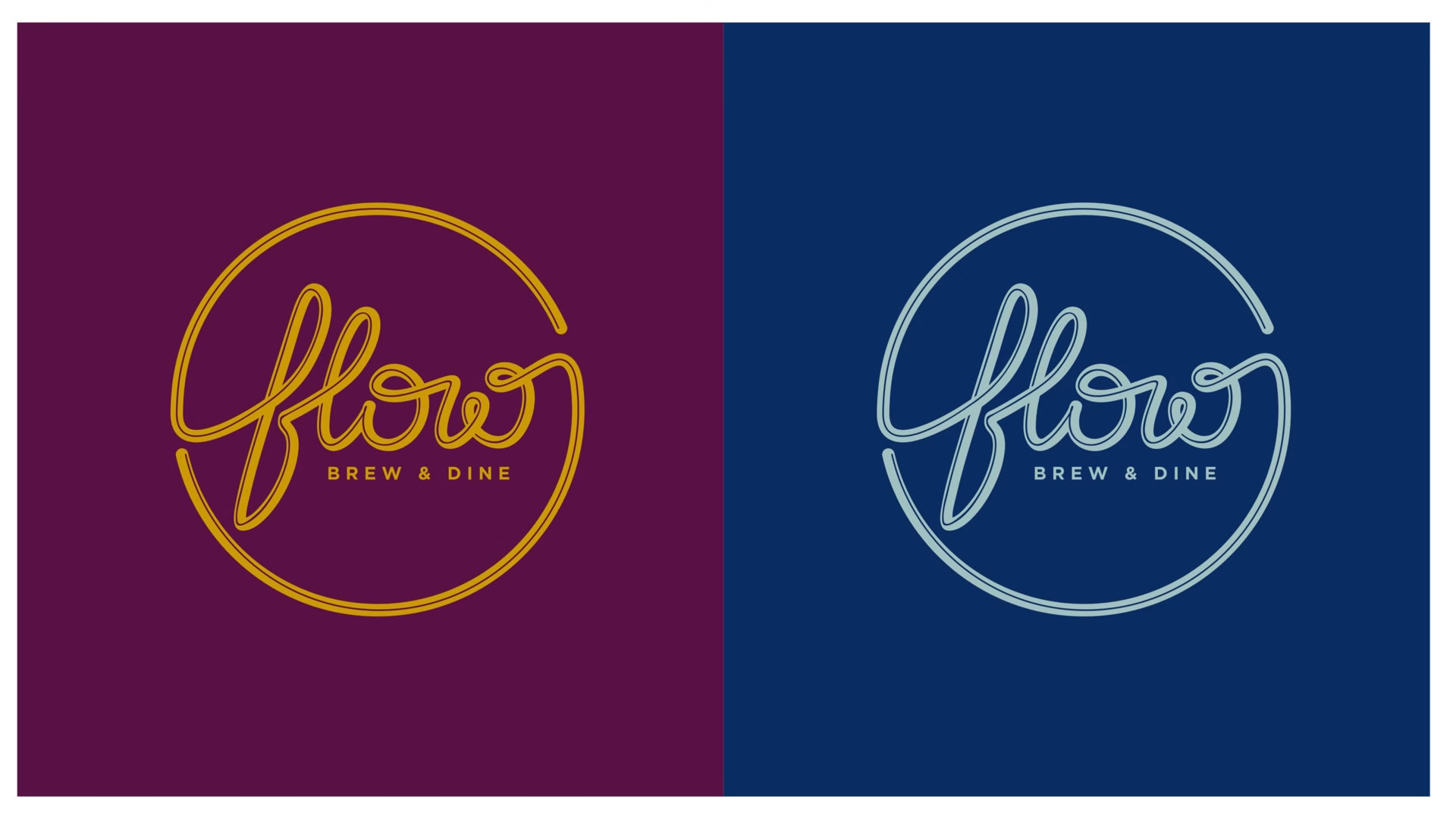
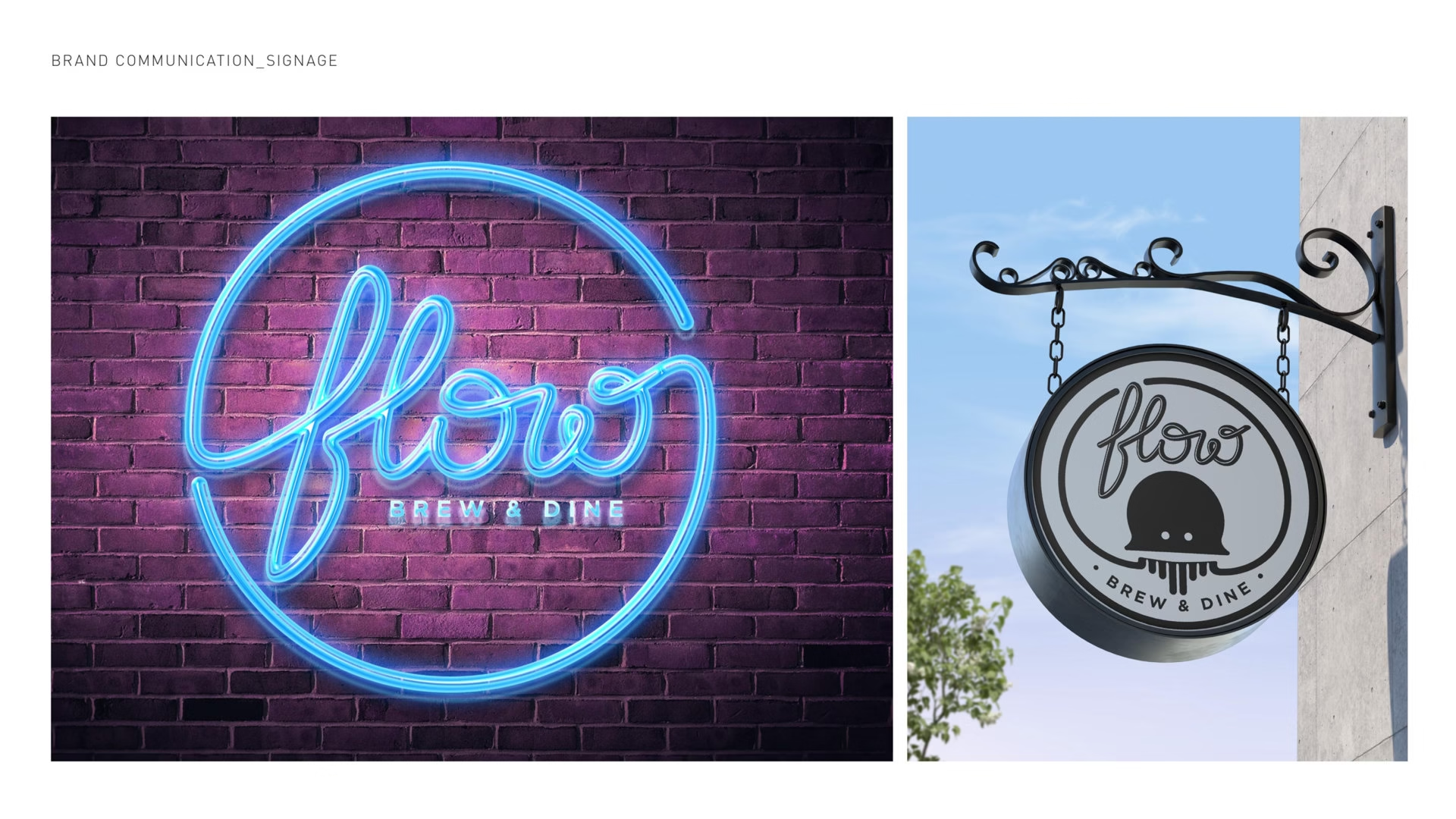
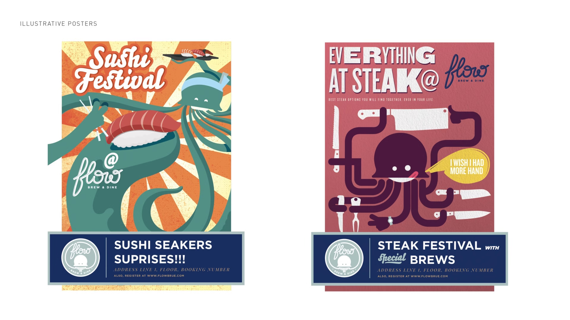
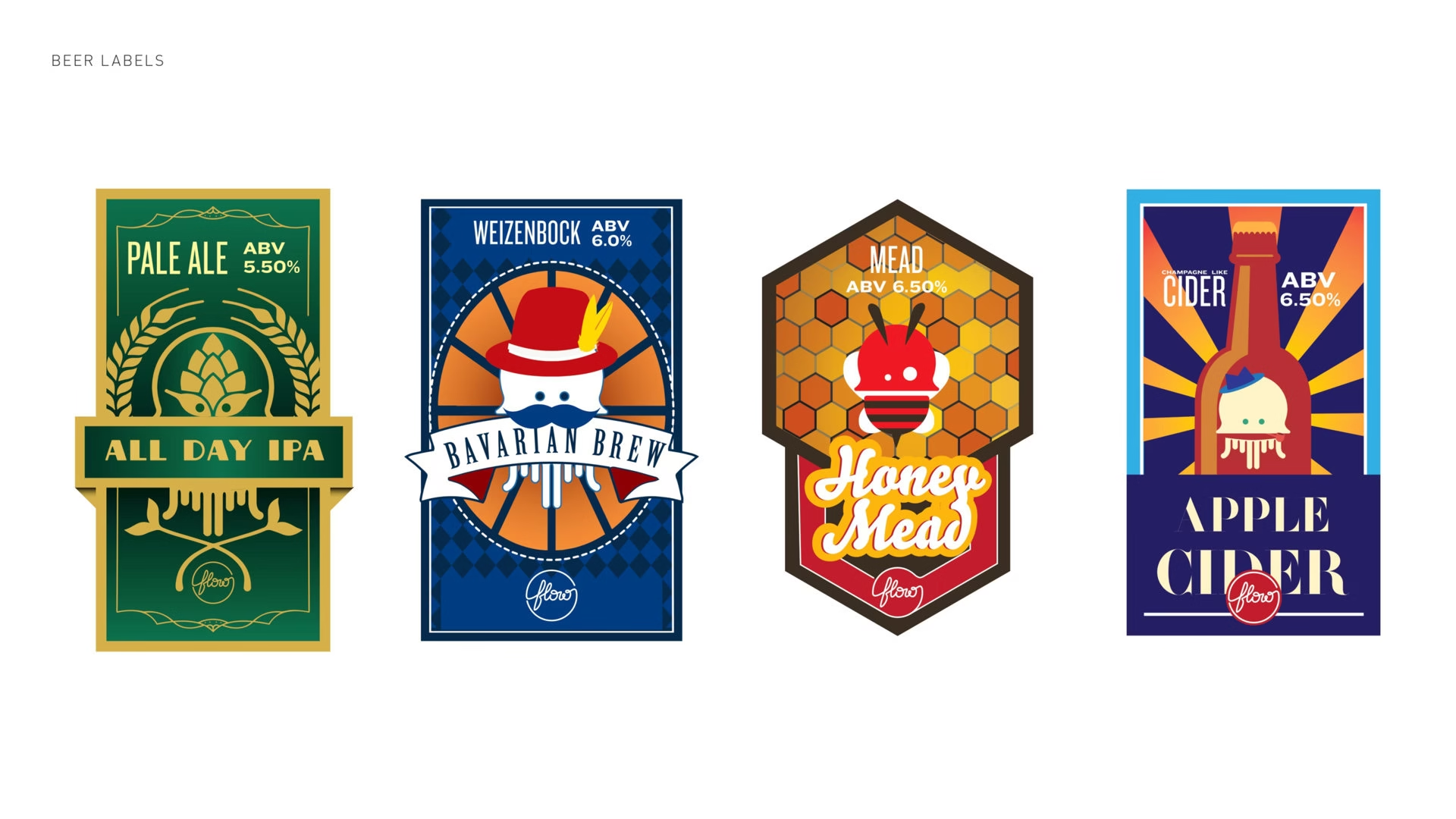
In the aftermath of the COVID-19 pandemic, there is a palpable apprehension among the target audience towards embracing novelty. People tend to gravitate towards familiar places and experiences due to fear and uncertainty. However, this inclination stifles curiosity and hampers the exploration of new realms. Flow aims to break this pattern by fostering an environment that ignites curiosity and promotes happiness through its unique offerings. The Logotype Design: The logotype embodies fluidity and continuity, departing from conventional styles with its seamless, hand-lettered design. It aims to evoke curiosity and excitement, standing out in the branding landscape.
Our Approach
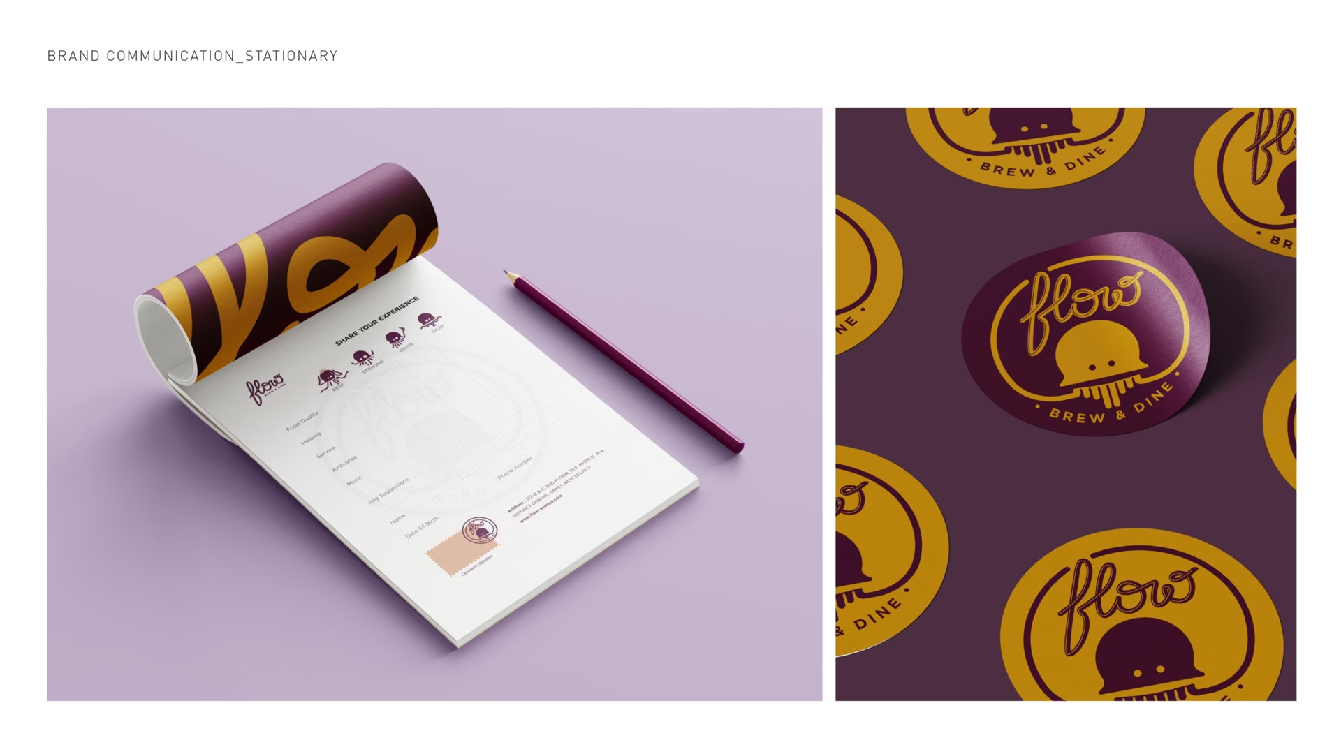
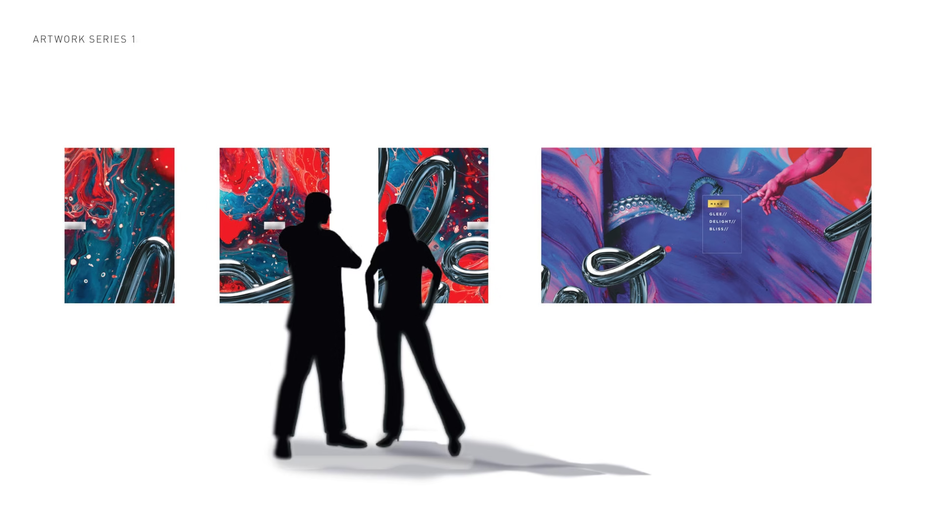
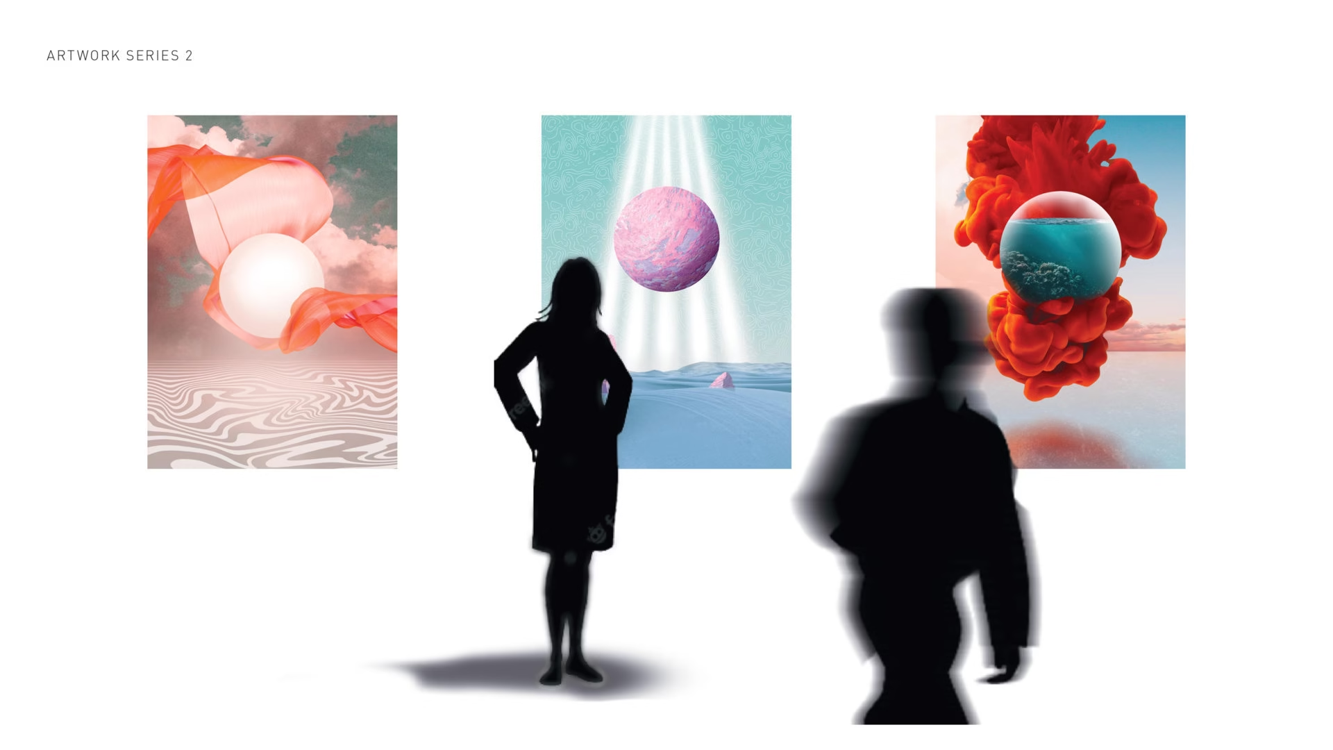
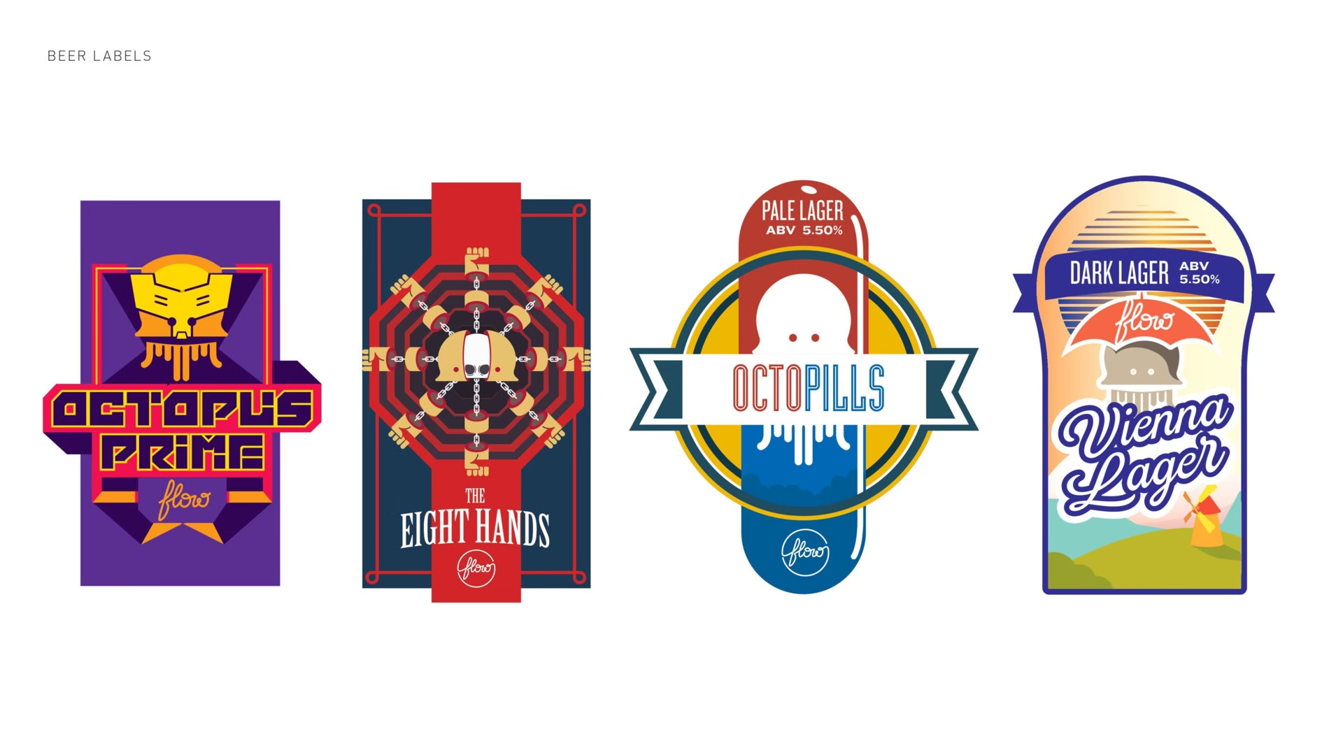
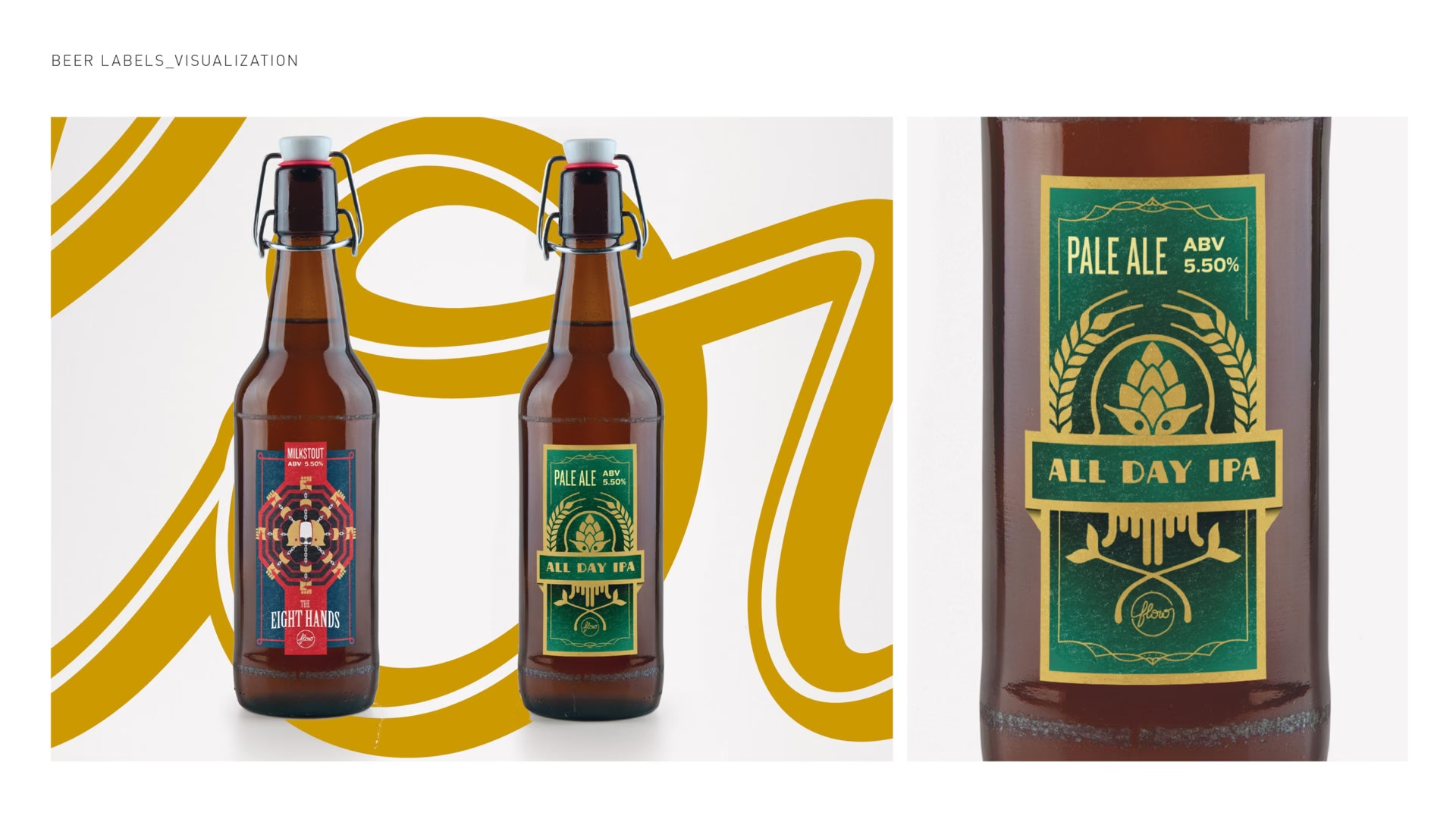
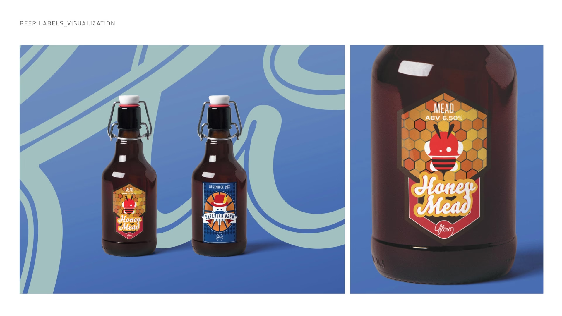
Mascot Concept: The octopus mascot symbolizes adaptability and intelligence, reflecting the brand’s ethos. Its quirky presentation enhances likability and fosters a deeper connection with audiences. Artworks: The interior artwork seamlessly blends art with modern brand communication, creating immersive environments that stimulate the senses and reinforce Flow’s commitment to innovation and uniqueness. Beer Labels: Flow’s curated beer flavors showcase dedication to quality and innovation, challenging norms and offering a redefined beverage experience for customers. Overall, Flow’s design approach seeks to disrupt the ordinary, inspire curiosity, and provide unique experiences to its audience.